Case Study: Improving the returning customer checkout at EKM
How my team removed two friction points for returning EKM customers – part of the checkout work that lifted conversion by up to 63%.
Quick summary
Returning customers were hitting two needless friction points in the EKM checkout: a page telling them they were logged in, and a details step full of pre-filled fields they reviewed but almost never edited. We removed both. Time-to-checkout dropped sharply for returning customers and conversion went up.
In 2018 my team and I undertook the challenge of addressing some of the friction points in the EKM platform checkout flow which is used by millions of visitors per day.
One of the key areas we wanted to address was that of returning customer purchases and how we could make it much easier for them to complete a purchase.
It’s important to understand that in the context of a product like EKM, and similarly Shopify, is that there is no one size fits all solution. The checkout is used by all shop owners with a minimal level of customisation. So it goes without saying that when we’re making improvements we need to be very mindful of the varying range of clients and business types.
A shop selling sheds will have a much lower repeat purchase rate than those selling makeup.
Prior flow for existing customers
A customer returning to an online shop would follow a flow very similar to the first-time purchase flow.
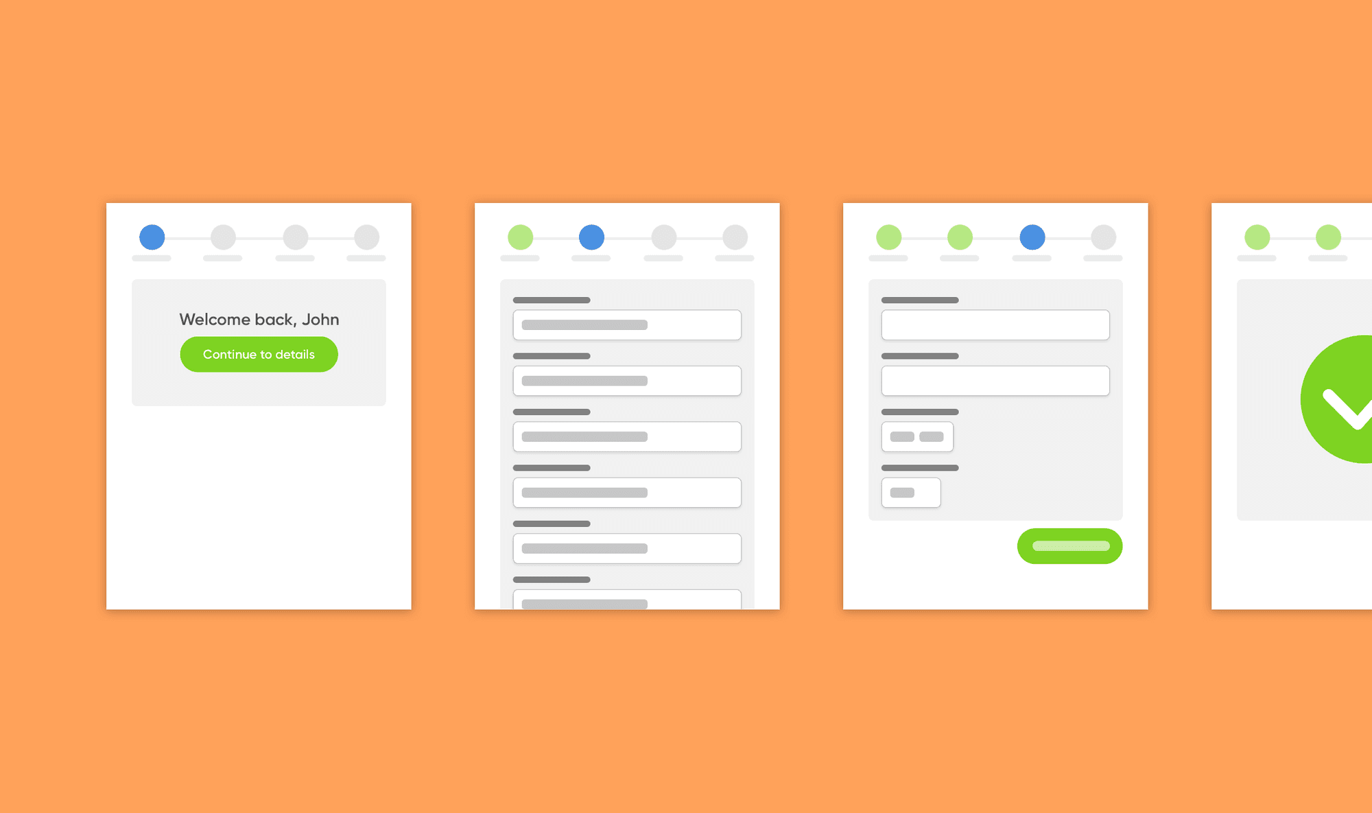
Cart
A customer adds products to their cart and proceeds to the checkout.
Customer Login
With shops where customer login is recommended (those with high expectations of repeat purchases) the customer is presented with a customer login page.
This page can be in 2 states.
- Customer is logged in – so they get a message saying they are logged in, an option to logout and the call to action to continue.
- Customer isn’t logged in – so they can either login (we actually recommended against this, more on this later) or continue as a guest.
Details
The customer, depending on their previously chosen path, either sees around 10 empty fields that need input or 10 empty fields that contain their details from a previous purchase. These details are mainly their name, telephone number and address.
From here the flow remains the same for everyone. The customer selects their delivery method, payment method and adds any further information the shop requires.
Why was the existing flow not converting as well as it could
There were a few reasons why our checkout flow could be causing customer drop-off.
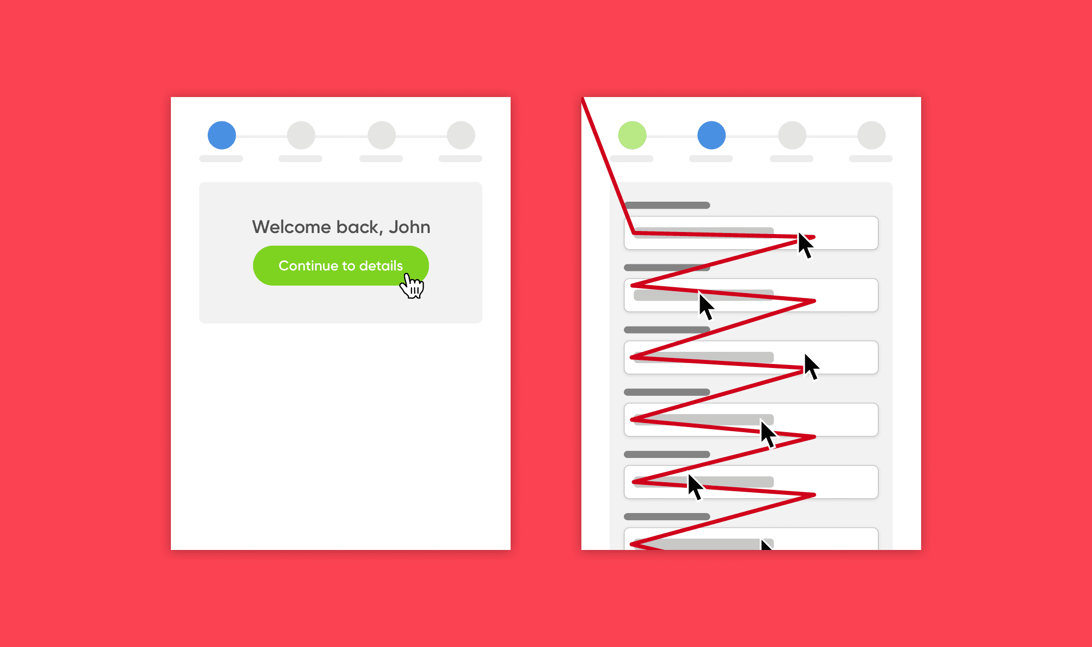
- Logged in customers enter the checkout to a page that could have been skipped.
- Logged in customers were shown their previously used details and in most cases continue to review every field before continuing.
- Returning customers were not completing a purchase much quicker than new customers.
All of these points, although insignificant alone, were causing customers who had high intent to abandon purchases quite early in the checkout process.
Worse still, these are customers who have purchased before and are not likely to have the same hesitations as new customers (trust and security concerns, delivery concerns, payment concerns, etc).
Finding solutions
As a team we considered a number of different solutions to try and remove, or at least reduce, the friction points we found.
Ultimately we weeded out the impractical ideas and landed on just two solutions that would tackle each of the points in some way.
Skipping the login step, if you’re logged in
To solve the issue of logged in customer seeing a screen telling them they were logged in – a step they had to navigate onwards from – we explored simply redirecting logged in users to the details step.
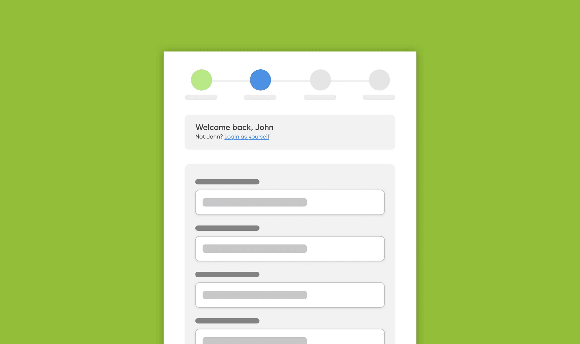
This solution introduces its own problem though. What if the customer doesn’t know they are logged in or someone else is logged in – we need them to have a path to see when they are logged in and give them a way to logout.
The solution we introduced was to simply redirect logged in returning customers directly to the customer details step. On this page we would display a banner to those customers telling them they are logged in and give them an option to logout and go back to the login step.
Display an overview of their details instead of editable fields
In our user research we found returning customers with a saved address would still review each field on the page to ensure the details were correct. Returning customers very rarely edited fields – we simply observed them slowly scrolling down the page checking details.
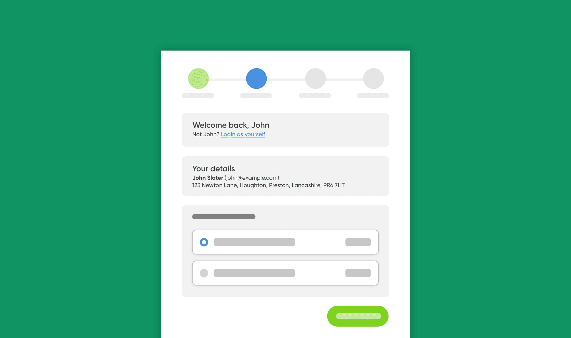
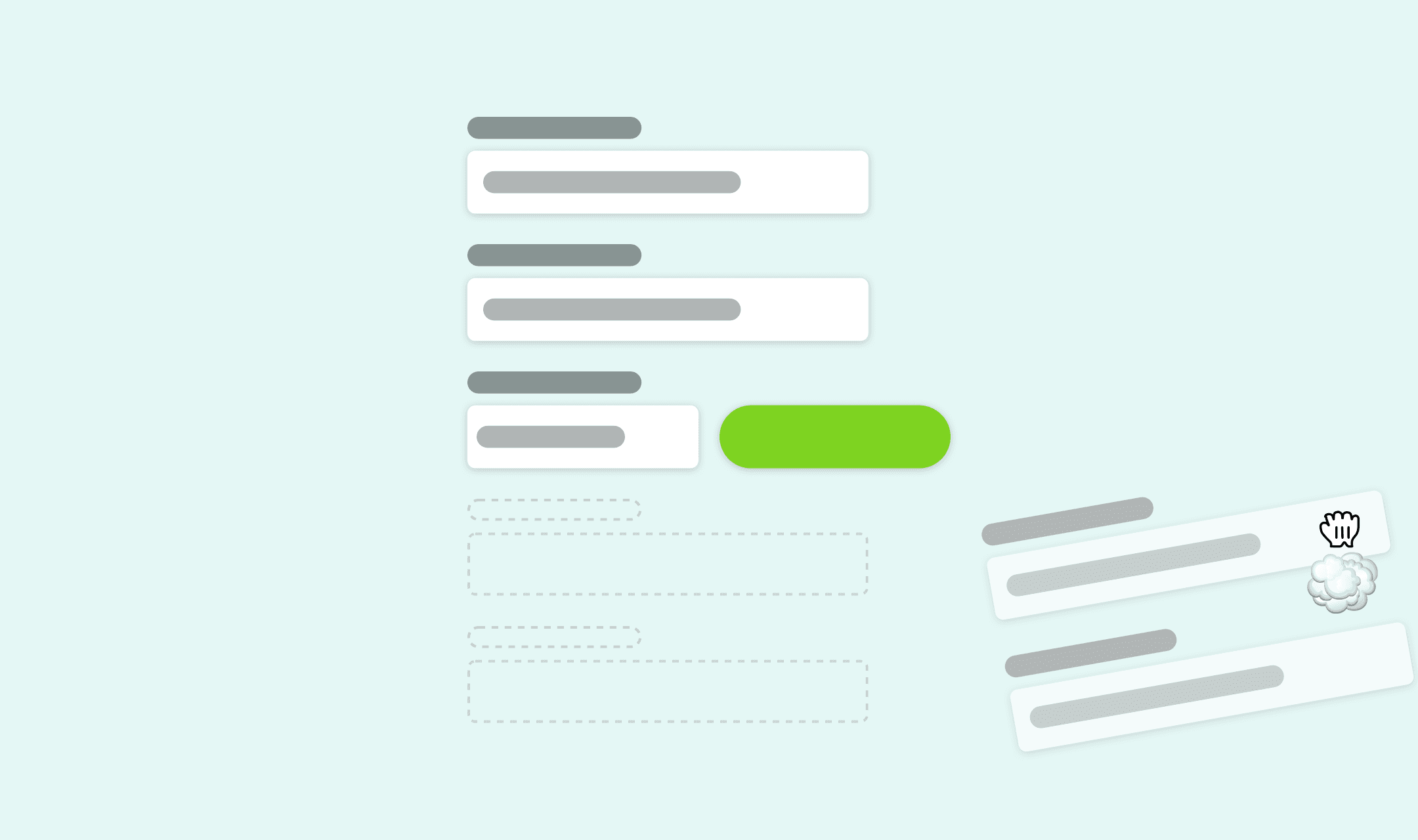
The solution we came up with for this problem was to show them a summary of their details in text form and give them an option to edit those details if needed. This solution reduces the details page from 10 pre-filled fields to zero fields.
What we observed after implementing this solution was returning customers would spend next to no time reviewing their details, since they were remembered from last time, and only in rare cases where the delivery address was going to differ did we see customers ever edit the details.
Reducing time to checkout
With the above two solutions in place we noticed that time to checkout for returning customers (previously not much different from new customers) was dramatically different.
Returning customers were not spending time navigating onwards from skippable pages and they were not spending time reviewing each field of their address which hadn’t changed since last time they used the site.
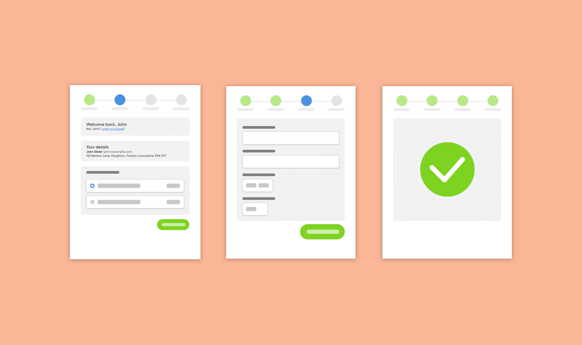
We found that by reducing time to checkout we substantially increased conversion rates for returning customers.
Lessons learned
In 2015 when my team was involved in the complete overhaul of the EKM checkout system – named Optimal Checkout – we concentrated on improving the user flow for the broadest range of users that we could.
When we eventually revisited the checkout user experience in 2018 we observed different subsets of users using the checkout and found that it wasn’t perfect for everyone and we could make many more improvements to the system. Reducing the number of address fields was another of those improvements – you can read about it in Increasing conversions by reducing the number of fields.
What I learned from this project is that seemingly small changes, such as redirecting the customer onwards if there is no action to take, can make a huge difference to the amount of time the customer spends thinking.
By reducing the amount of time customers can think about their purchase we can actually increase the conversion rate because customers are less likely to abandon.
Work is never complete on a project like an ecommerce checkout – especially one used by thousands of shops and used by millions of customers daily – so continue to observe and refine.